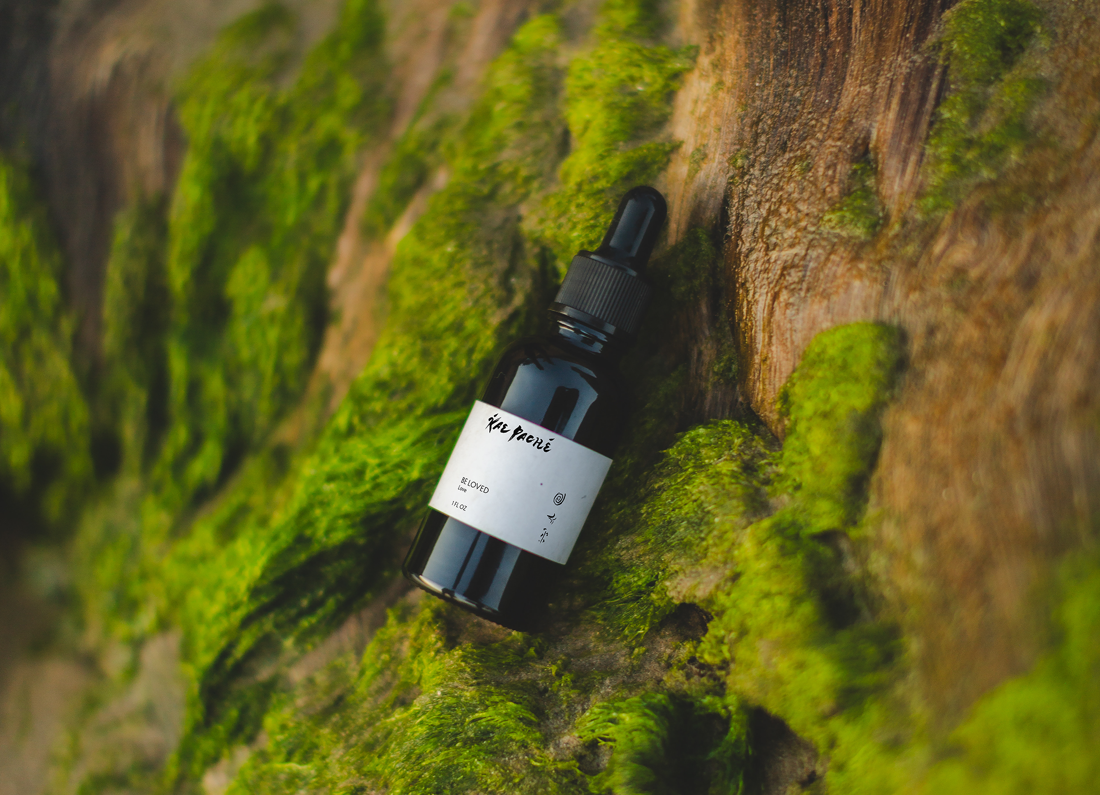
Visual identity, brand guidelines, digital design, social media strategy
Giving form to a practice rooted in sensitivity, lineage, and inner transformation.
COLLABORATORS
Sarah Kathryn Wainright

IN THE BEGINNING
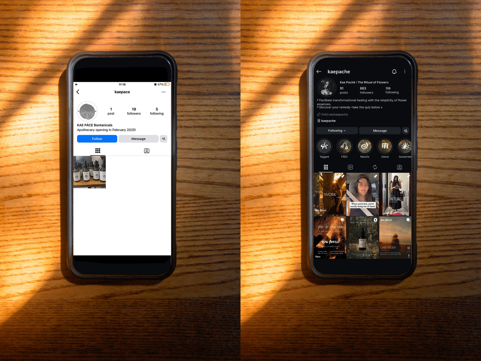
Sydnie Pace came to me with an Instagram page, one photograph, and a simple spiral logo for her brand’s identity. Underneath that early stage was something much more developed: a belief in gentle, individualized healing through the power of interacting with the essence of flowers.
Kae Paché’s blends are tailored in every sense of the word. Not only to the emotional needs of the user, but also to the inner chemistry of the person using them. With such a sensitivity built into the brand, I felt the need to make it seen and heard.


Photography by Sarah Kathryn Wainright.
FELT AND DISCOVERED
Our first conversations went beyond the usual questions about audience and competitors; I wanted to understand Sydnie's relationship to the deep work.
Through those conversations, I learned about her lineage which happened to have a strong connection to handmade practice. Coupled with her own desire to honor inner wisdom, and the organic nature of her work, Kae Paché’s foundational identity was steadily forming.
Sydnie’s an intuitive artist who makes things with her hands, for love and profit. I wanted the brand to feel crafted, too, for an audience who was seeking a radical, self-owned approach to healing.
FUNCTION INTO FORM
The idea was already there. My priority was to uncover it and give it an identity that felt as beautiful, considered, and truthful as the practice itself.
When Sydnie came to me, she had a name (then Kae Pacé), and a spiral logo that she’d sourced herself, but the brand didn’t speak profoundly to her process, values, or way of helping others see the potential in her distinct product. Additionally, not only did she have her own logo, but she’d had labels printed for her first blend.
The editorial process kicked in: It wasn’t necessarily about throwing out the whole identity she’d crafted for herself. An introductory call with her revealed her reasoning for using a spiral, which became reinforced and reimagined as we worked together. After all, her instinct led her to choose a spiral as an element, and I honored that instinct as part of the redesign.
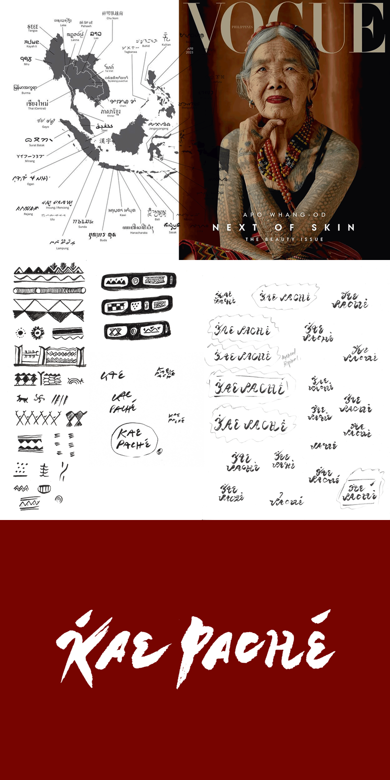
Discussing the spiral was also a way into Sydnie’s interest in working with symbolism; while speaking about her inspiration, she’d referenced Filipino tattoo traditions and their use of representing themes. That opened up a brand new way of thinking about the identity. What if the visual language could communicate the same way?
Rather than decorative marks, I developed an iconographic system that could tell stories about each botanical: the ingredient, its origins, the way it was made, and what it might offer the person using it.
DESIGNING PEACE
The identity’s wordmark was built from a reconstruction of the Filipino alphabet, creating a direct connection to Kae Paché’s heritage. The name itself means “pure peace.”
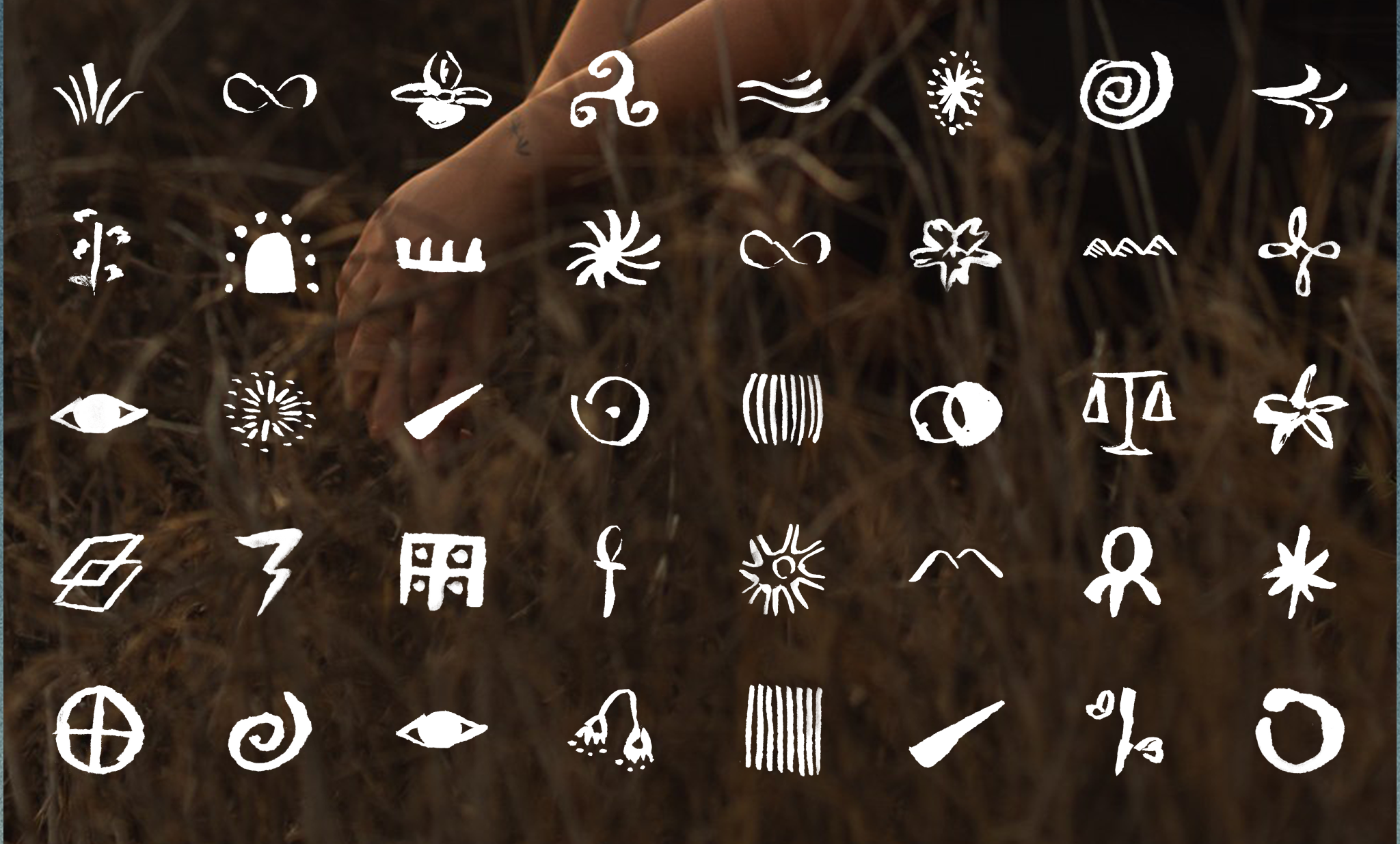
Following the calligraphed style of the wordmark, I then developed an illustrated icon library, initially imagining three symbols for each blend. The visual language of the icons served to inform users what each blend is indicated for addressing.
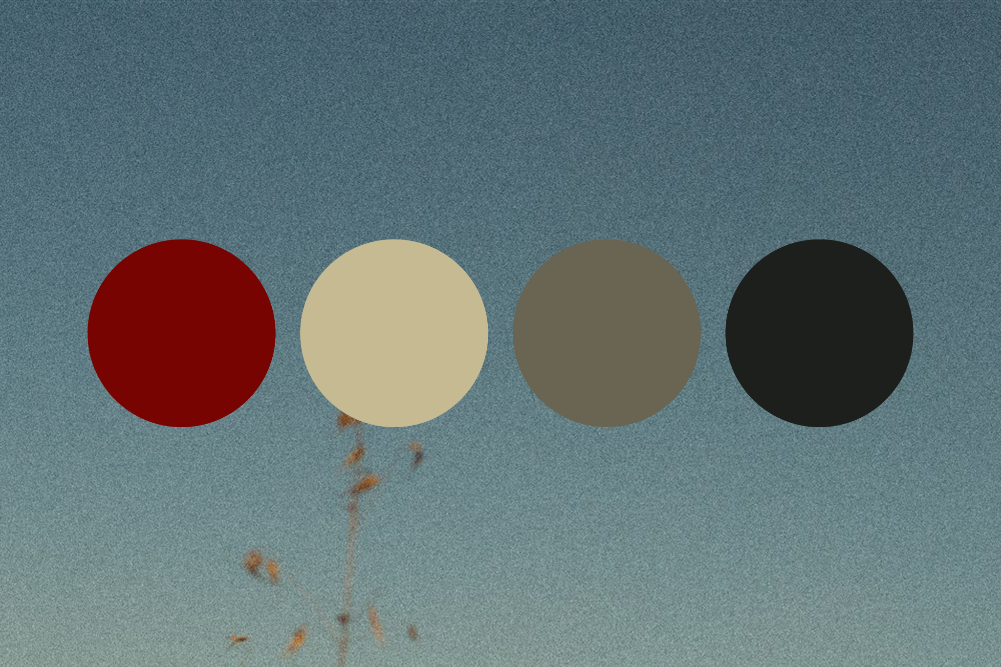
The color story, constructed to serve as a narrative through the Kae Paché deliverables, came from image research around depth, blood, mystery, elemental truth, and time.
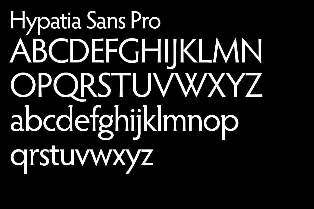
Typography was chosen intentionally to be readable on the Kae Paché website and Instagram channel while not overpowering the strong visual language that was created. Hypatia Sans (Thomas W. Phinney II, Adobe) was chosen for its humanist warmth; it balances the expressive elements without competing with them.
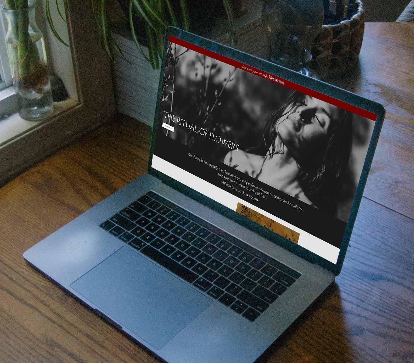
I designed the Shopify website and developed a quiz that helped customers find a blend based on their emotional state; from heartbreak and lovesickness to courage and other personal needs.
BEYOND THE LAUNCH
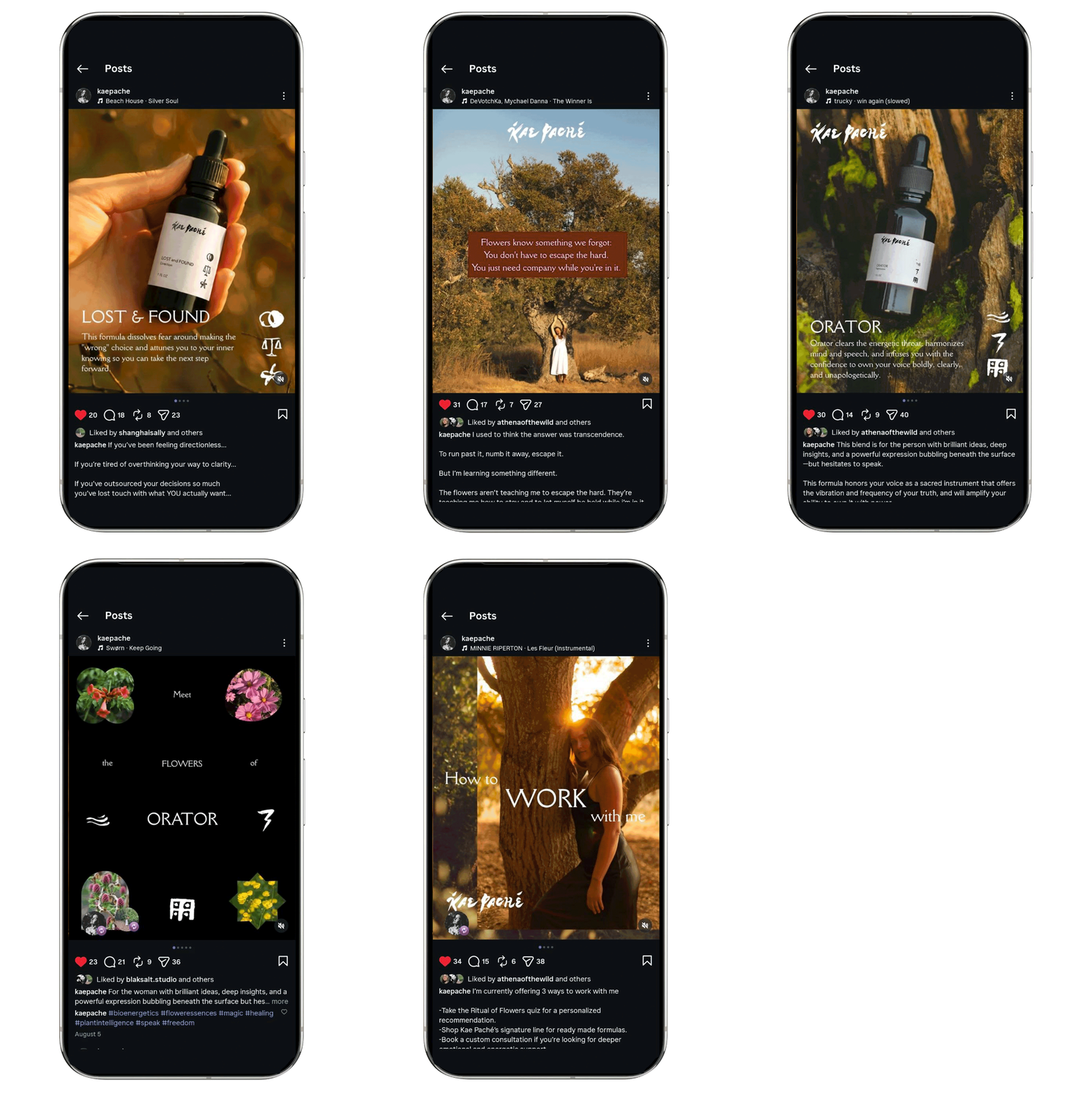
I created Canva templates for Kae Paché’s Instagram and gave Sydnie lessons through Telegram on layout and composition, helping her understand the editorial principles behind the system and how they could translate across platforms.
I stayed in touch with her for the following year as the brand developed through a Telegram “hotline,” where she would have full access to me, should she have concerns about working with her assets. In one session, we worked on layout principles for social media. In another, we finessed her copy direction.
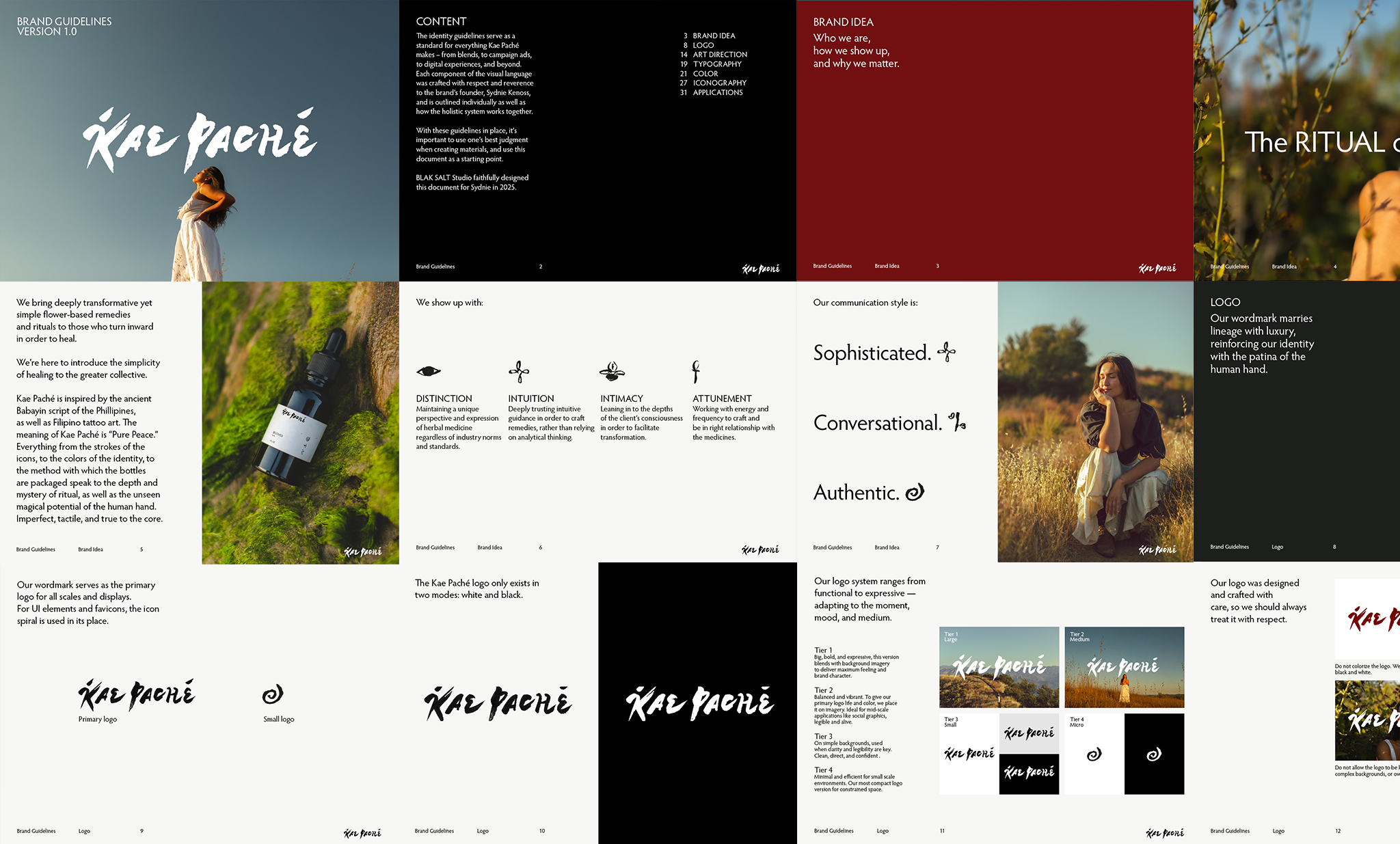
Following the website and Instagram, the system also included comprehensive brand guidelines that were meant to be updated every quarter to catalog the progression of the brand’s identity and voice.
ALL IN ALL
I approached the project as one maker working with another.
For me, a founder should feel comfortable living inside their identity. If the brand feels like an extension of who they are, communicating it becomes more natural and more genuine.
The identity wasn't designed to create distance between Sydnie and her work. It was designed to give her a language for expressing it.
We wanted to build something with longevity. My role was to give her enough structure to evolve the brand without losing what made it Kae Paché in the first place.
The brand system supported Kae Paché's transition to retail partners and enabled seamless rollout of new blends without additional design investment. Sydnie reported that the guidelines gave her confidence to brief future collaborators independently.

“I feel so taken care of. You set such a high standard for who I’m willing to work with.”
– Sydnie Kenoss, Kae Paché