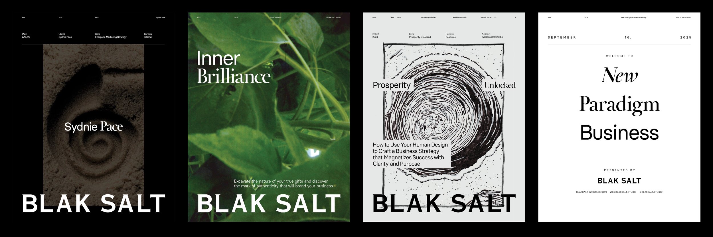
Visual Identity, Naming, Guidelines, Architecture, Strategy, Campaign
I founded BLAK SALT during a period of considerable personal change. Having left New York City and become a father, I began reconsidering what I wanted to contribute through design, and who I wanted to work with.
COLLABORATORS
Athena Manolopoulos
YEAR
2020
I came to believe that people feel at home when they live by their values, and that brands should be no different. BLAK SALT grew from that idea: an independent creative studio dedicated to helping entrepreneurs build identities that reflected what they genuinely believed in.

NAMING AND PHILOSOPHY
BLAK SALT grew from my interest in cooking and the belief that good design, like good food, begins by respecting the integrity of its ingredients.
Black represented the unseen: a place of depth, possibility, and untapped potential. Salt represented the essential qualities that give something its character, bringing out flavors that already exist.
Together, they expressed the studio's founding principle: to look beneath the surface of an identity and reveal what makes it distinctive, rather than impose something artificial upon it.
The spelling was also a graphic decision. Removing the c gave BLAK and SALT equal weight, creating two four-letter words with a stronger visual relationship. My initials, AK, became part of the name itself.
THE LOGOTYPE
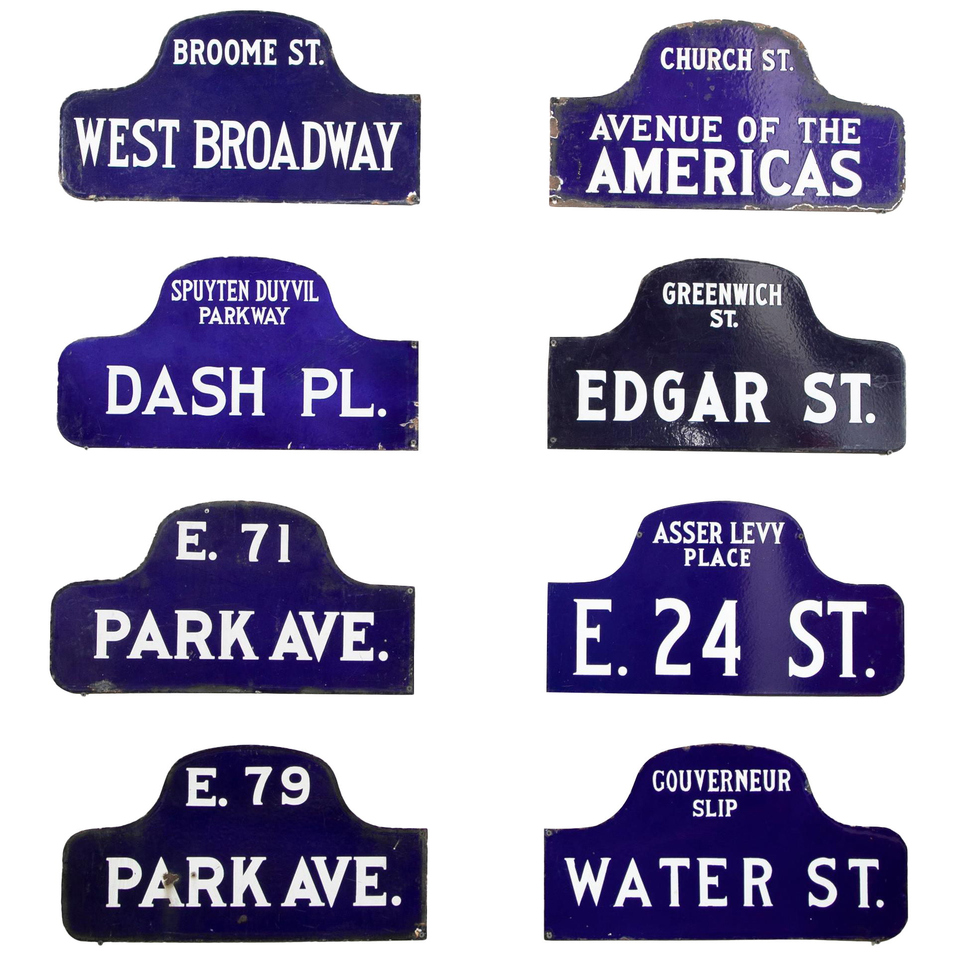
The BLAK SALT logotype was constructed from letterforms found on historic New York City street signs dating to the turn of the twentieth century.
I modified the original forms, thinning their serifs and strengthening their vertical strokes to create something both humanist and firmly rooted. The intention was to preserve their individual character while giving the identity a sense of conviction, reflecting the studio's belief in knowing who you are and what you stand for.

PHOTOGRAPHY
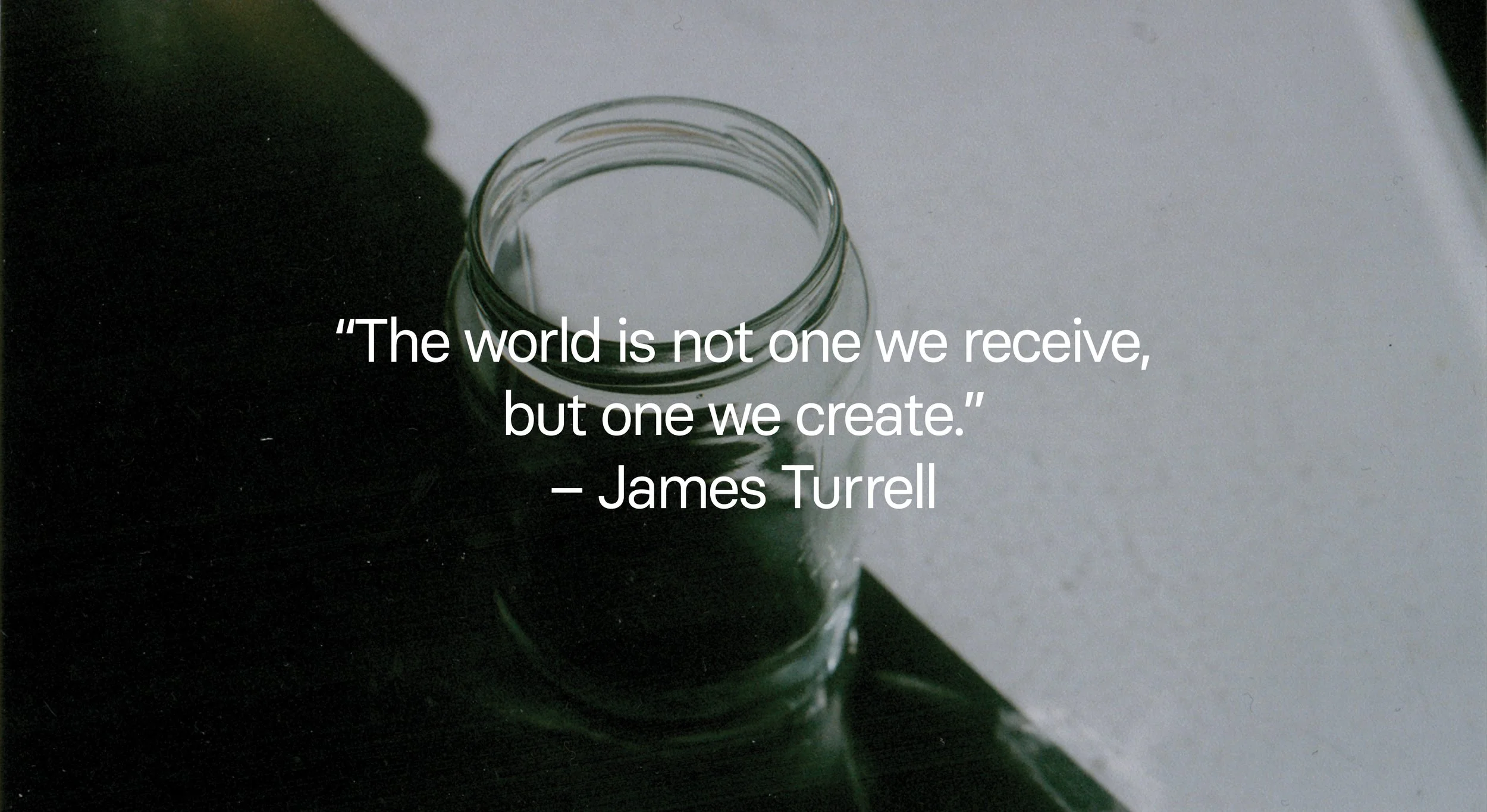
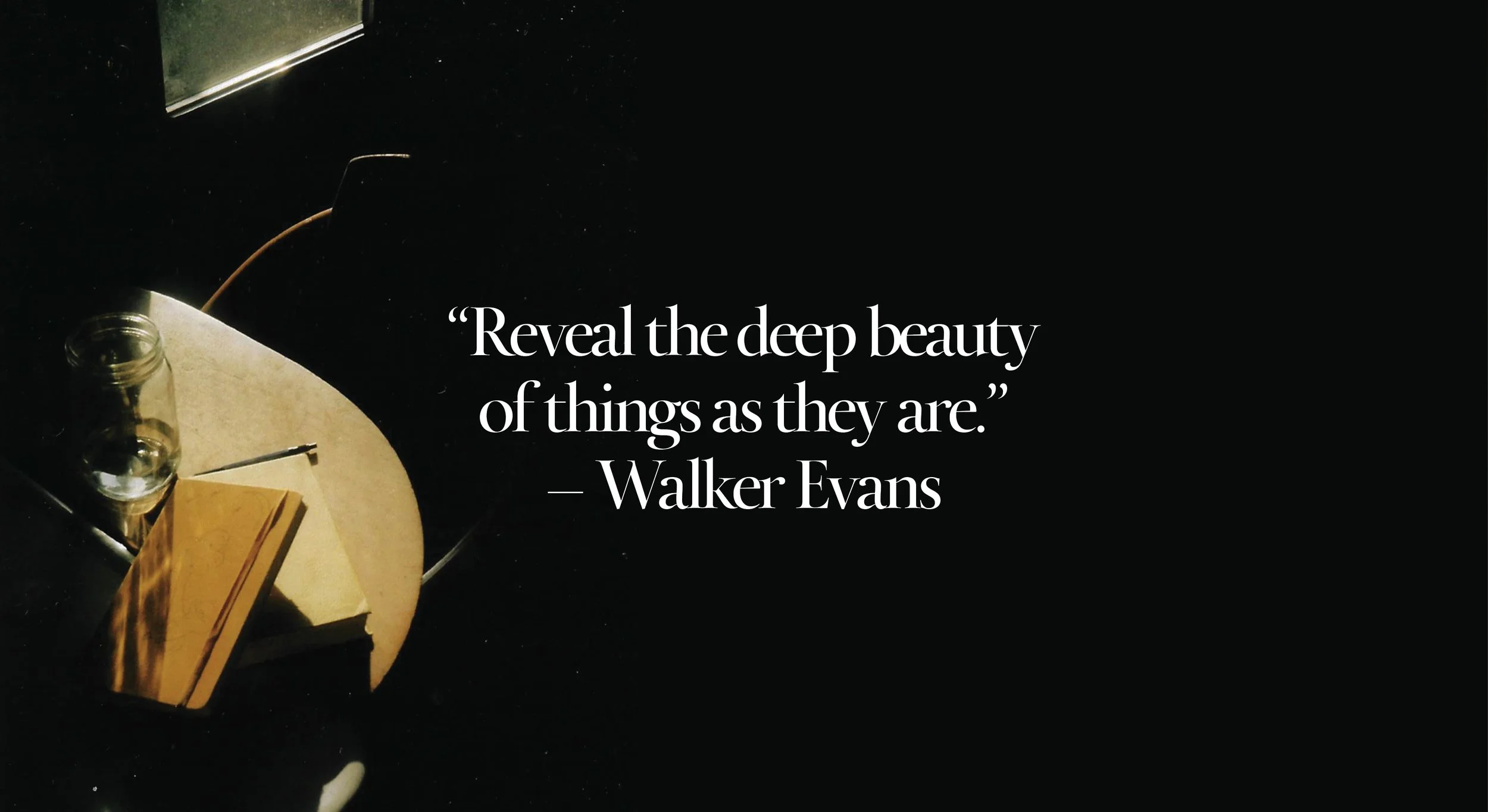
Photography became the foundation of BLAK SALT's visual language. With a disposable film camera, I documented my immediate surroundings: moments in the kitchen, plants, natural textures, and details discovered around the city.
At a time when work and relationships were becoming increasingly digital, I wanted something tangible to hold on to. Film offered a sense of permanence, and its imperfections became part of the identity's character.
Rather than constructing an idealized image of the studio, I wanted to show the world as I experienced it, without pretense.


TYPOGRAPHY
Helvetica and Times New Roman have always appealed to me for their dependability and relative anonymity. They're familiar, unpretentious typefaces that allow the work to speak for itself.
For BLAK SALT, I chose Basier Circle and Calendas, two contemporary interpretations of the traditional sans-serif and serif pairing, both designed by the independent Atipo Foundry.
Basier Circle was used for functional information, while Calendas introduced character and a more distinct editorial voice. Together, they preserved the simplicity I admired in their predecessors while suggesting a new direction.
Where the logotype paid homage to the New York I had left behind, the supporting typography represented a willingness to move forward.
APPLICATIONS
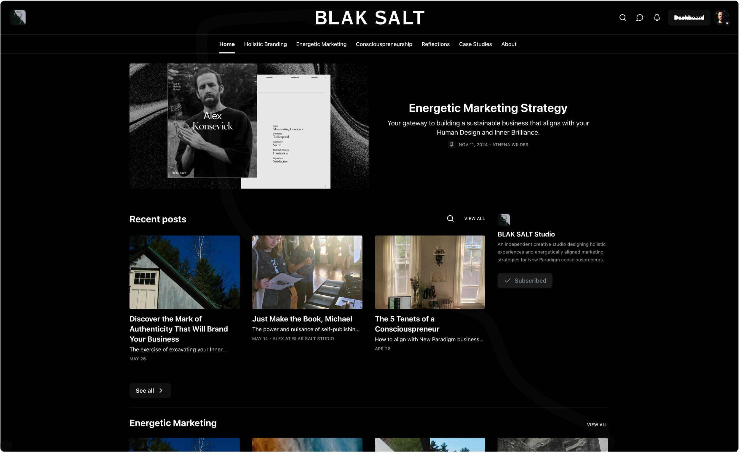
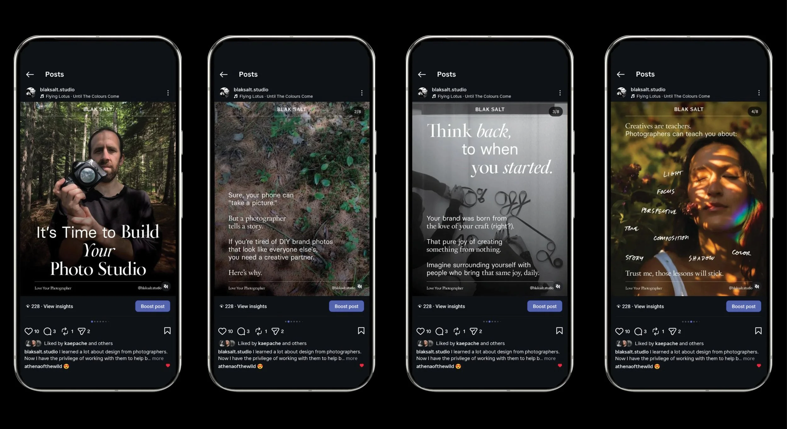
As BLAK SALT developed, my fiancé Athena joined the studio, bringing her experience in marketing and strategy. Together, we expanded its offerings through editorial content, social media, and proposed workshops.
The existing identity became the foundation for these communications. Its typography, photography, and restrained visual language allowed us to introduce new ideas without departing from the studio's original character.

“With only small direction they got the essence of what I wanted, and made something that felt like a fractal of myself and my offerings. It’s almost creepy, as though they looked inside my brain!
It feels good to support real humans and an organic creative process.”
– Amanda MacGillivray, The Birth of You
WHAT I LEARNED
BLAK SALT taught me to listen more than I spoke. Through long, open conversations with clients, I learned to let the relationship guide the creative process, rather than impose a predetermined method.
The most useful materials often emerged from the conversations themselves. I made what I felt was needed to understand the person in front of me, and to help them recognize what was already true about their business.
I also learned the value of working with people over time. The strongest identities weren't necessarily developed quickly, but through trust, patience, and a shared commitment to getting things right.
That approach continues to inform how I work today.