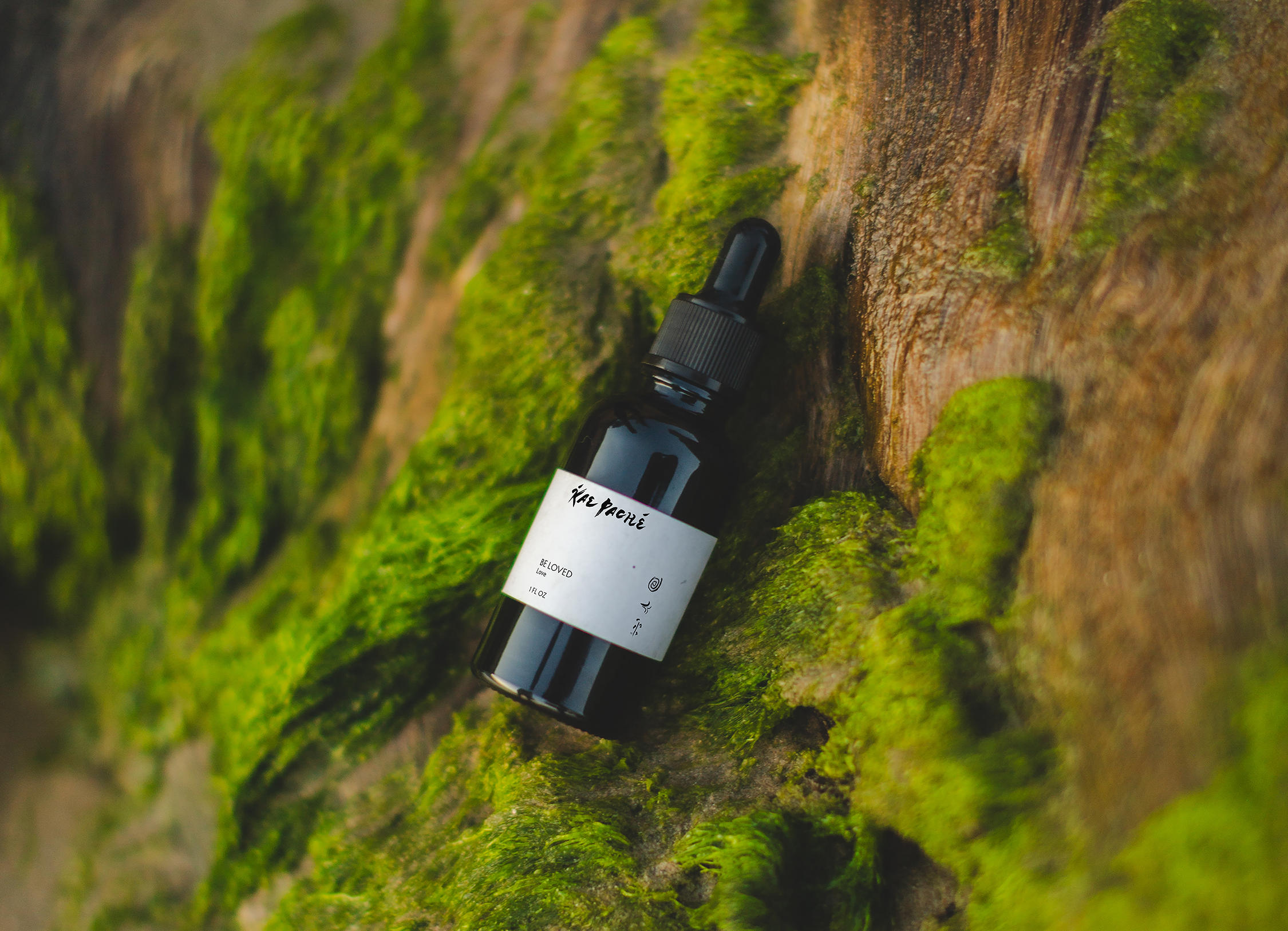
Kae Paché
Identity, Packaging, Guidelines
Kae Paché, translated in Filipino as “Pure Peace,” is a flower remedy brand that’s about conscious consumption, not pushing a protocol. Kae Paché’s founder Sydnie Kenoss champions self-expression, intuitive guidance, and facilitating the simplicity of healing to the greater collective.
Collaborators
Sarah Kathryn Wainright
Kae Paché was created to fill a much-needed gap in the homeopathic industry: a brand that doesn’t rely on analytical thinking and one-size-fits-all prescriptions, but rather on deeply trusting guidance from the emotional body and maintaining right relationship with natural medicines.

Sydnie came to BLAK SALT with a powerful premise: honoring her own lineage, just as she wanted her customer to participate with her medicine.
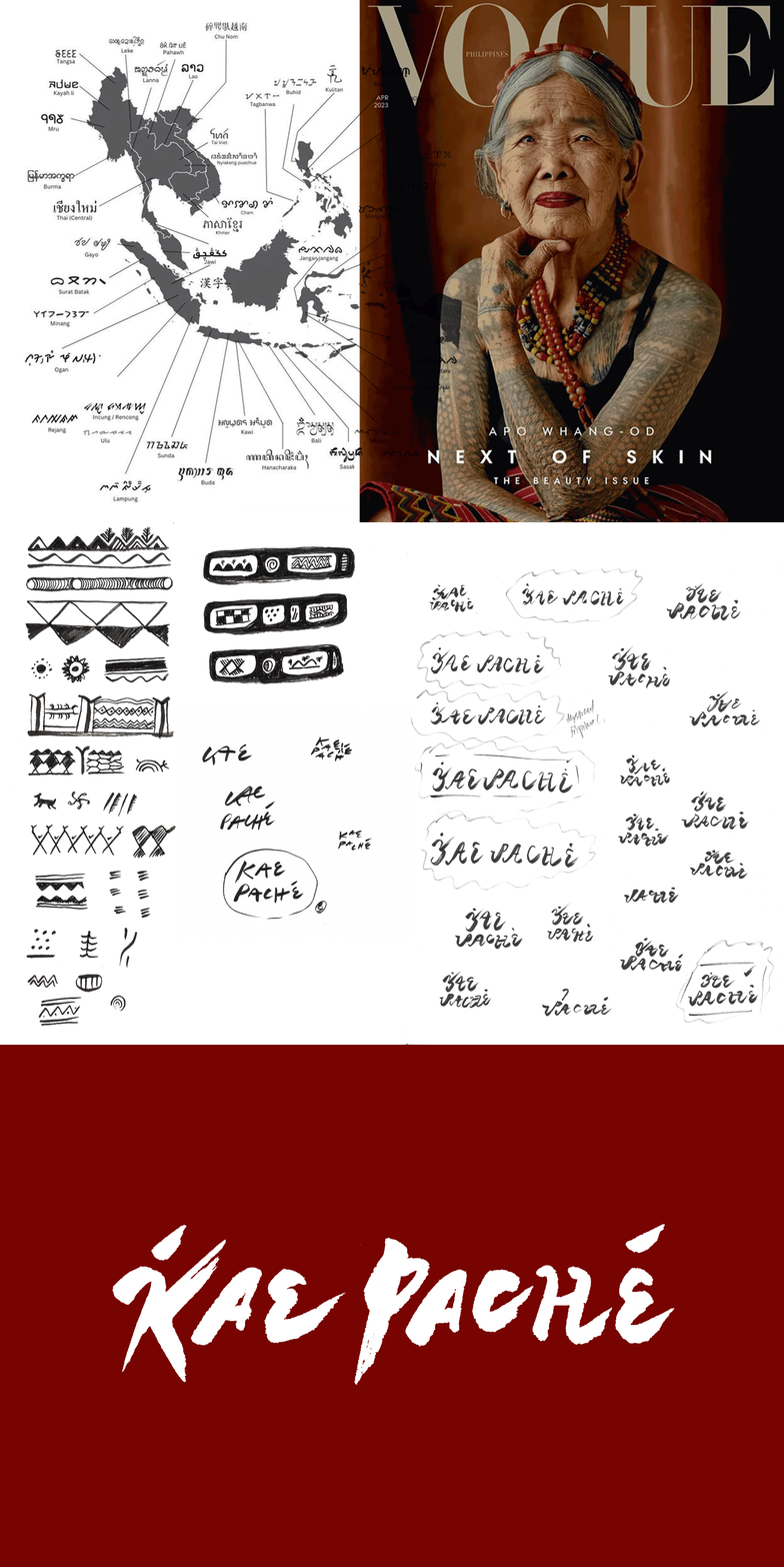
In our research into the origins and experimentation of Sydnie’s cultural heritage, we read about and studied the origins of Babayin, the time-honored alphabet of the Phillippines.
This informed the dimensional foundation of the brand system, demonstrated here.

Photography by
Sarah Kathryn Wainright.



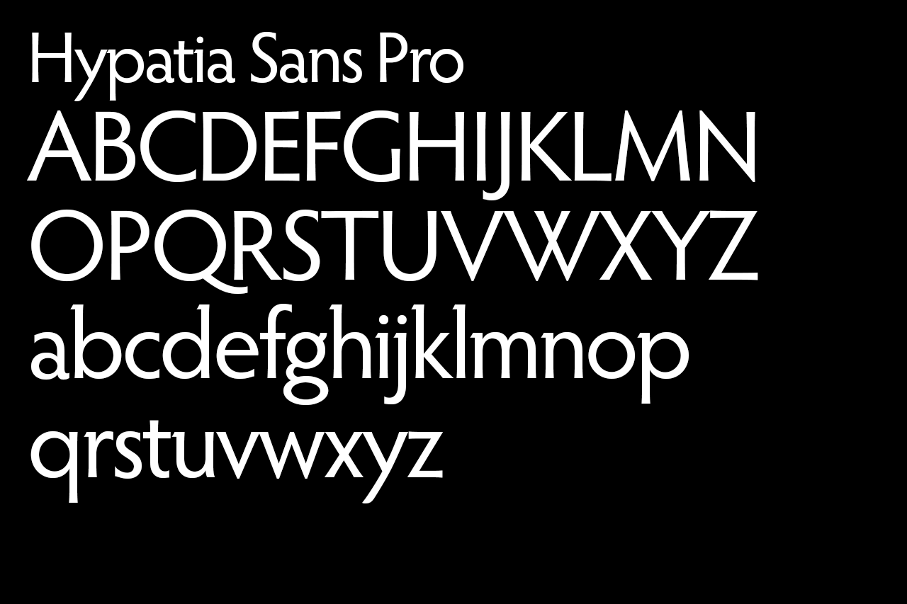
A brand that relies on simplicity and the nuances of what’s made through the human hand, the voice is driven by Hypatia Sans Pro, designed by for Thomas W. Phinney II for Adobe.
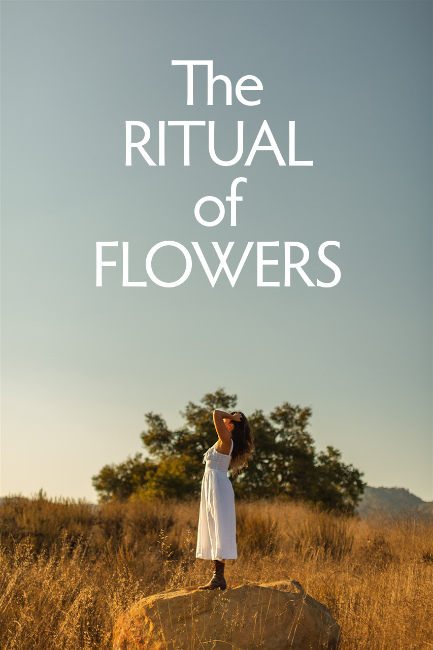
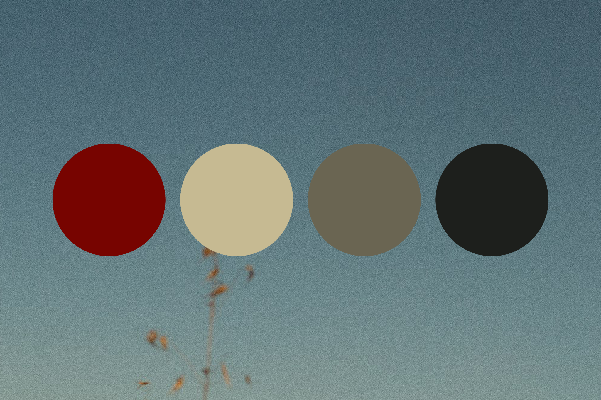
Kae Paché’s presence is primarily felt, not seen. Reflecting this concept, our brand palette is rooted in deep earth tones, allowing our imagery to provide the visual richness and tonal depth.
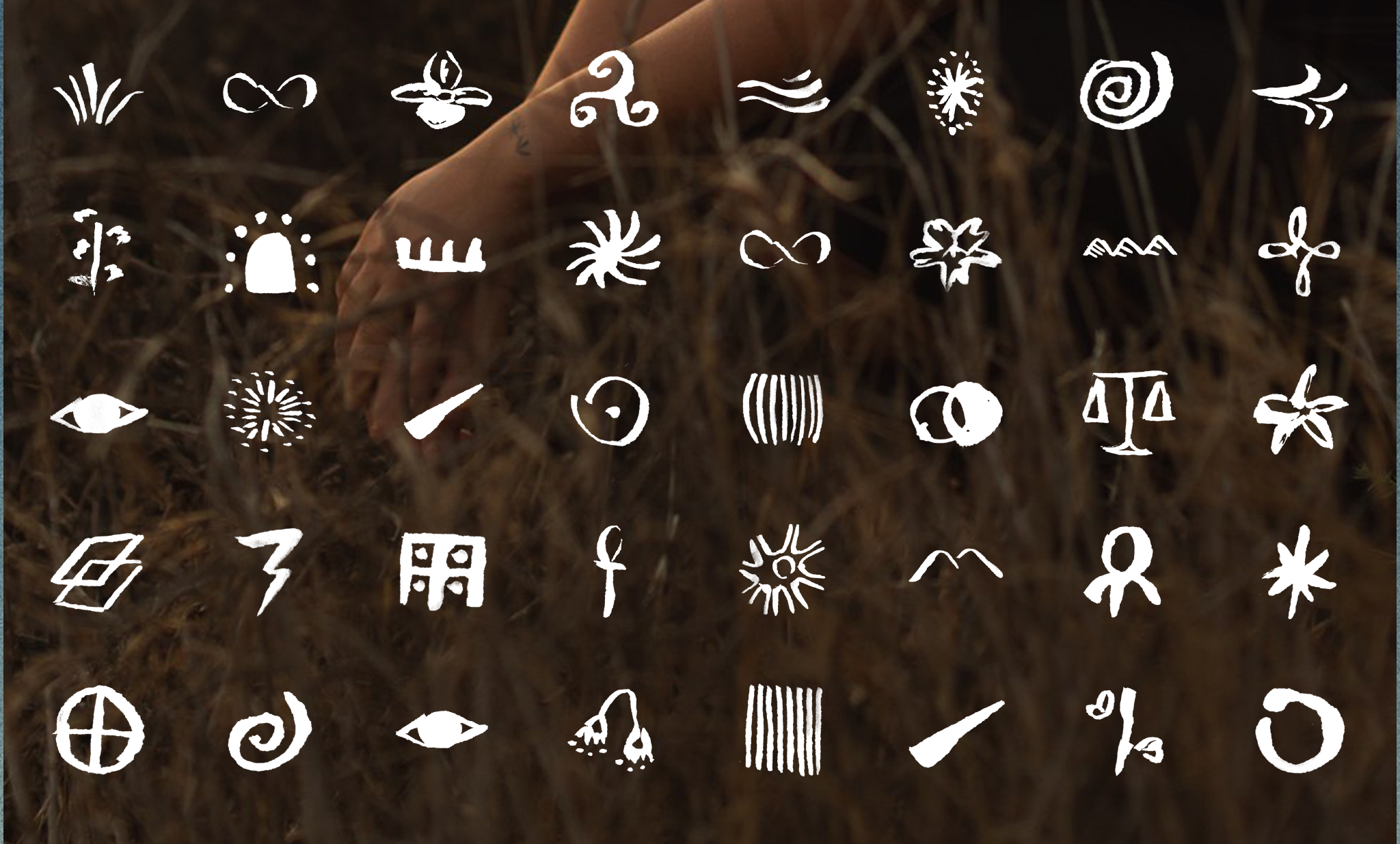
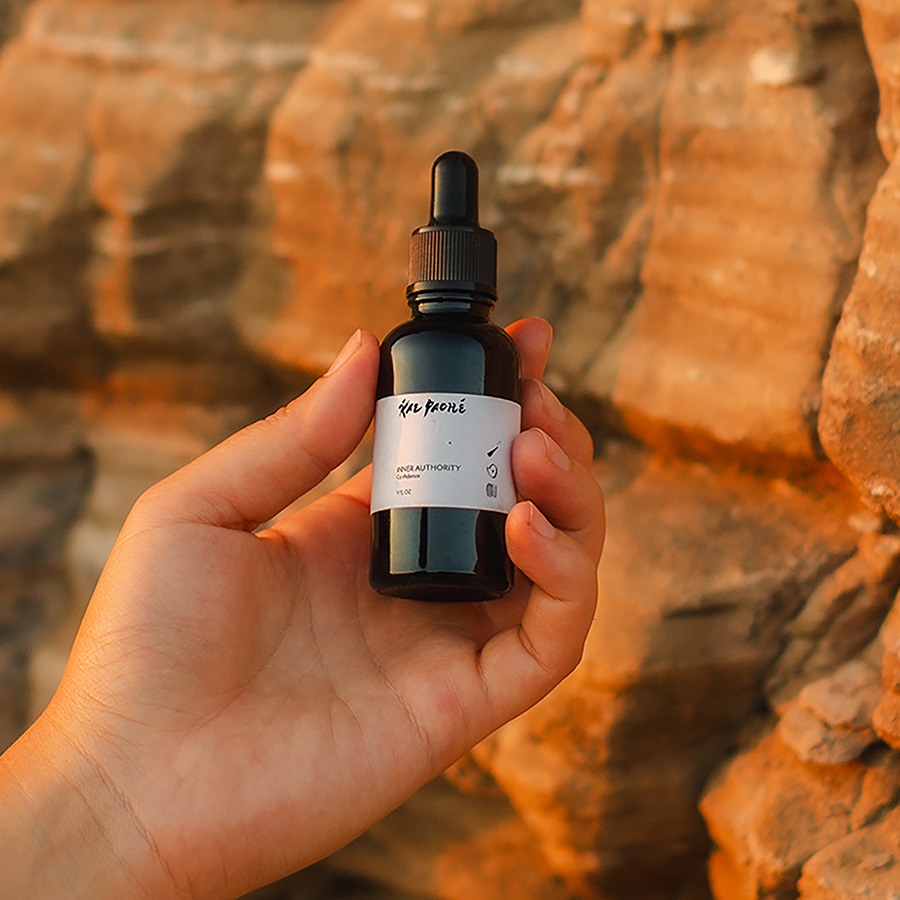
The Kae Paché brand icons act as hieroglyphics. Each icon is a representation of a theme that’s relevant to the blends. For each blend label, there’s a specific combination of icons to use.
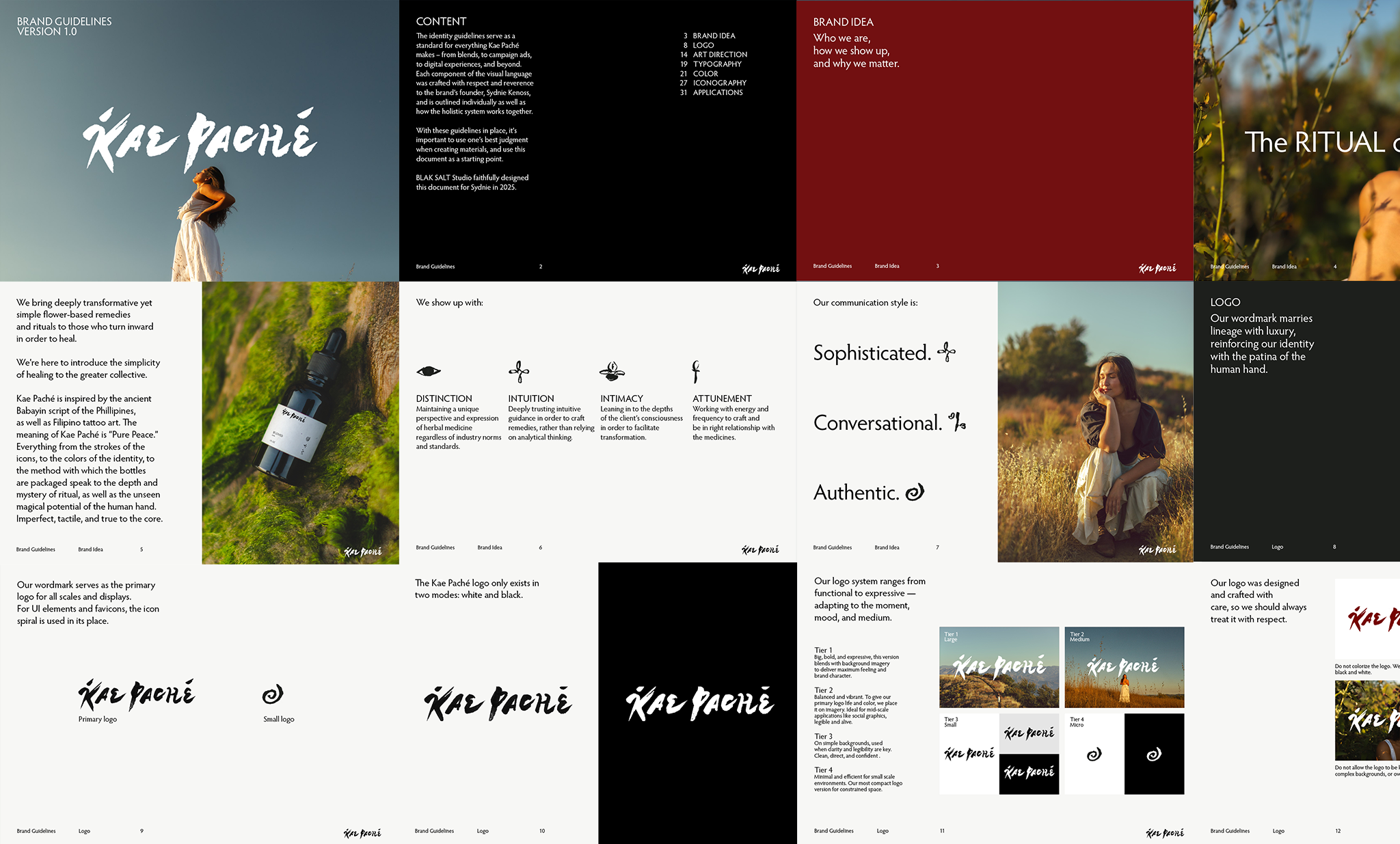
Kae Paché was supplied with a comprehensive brand guide, accessible offline, that would be constantly updated.

More on Kae Paché’s website, including an online Find Your Custom Blend-style quiz.
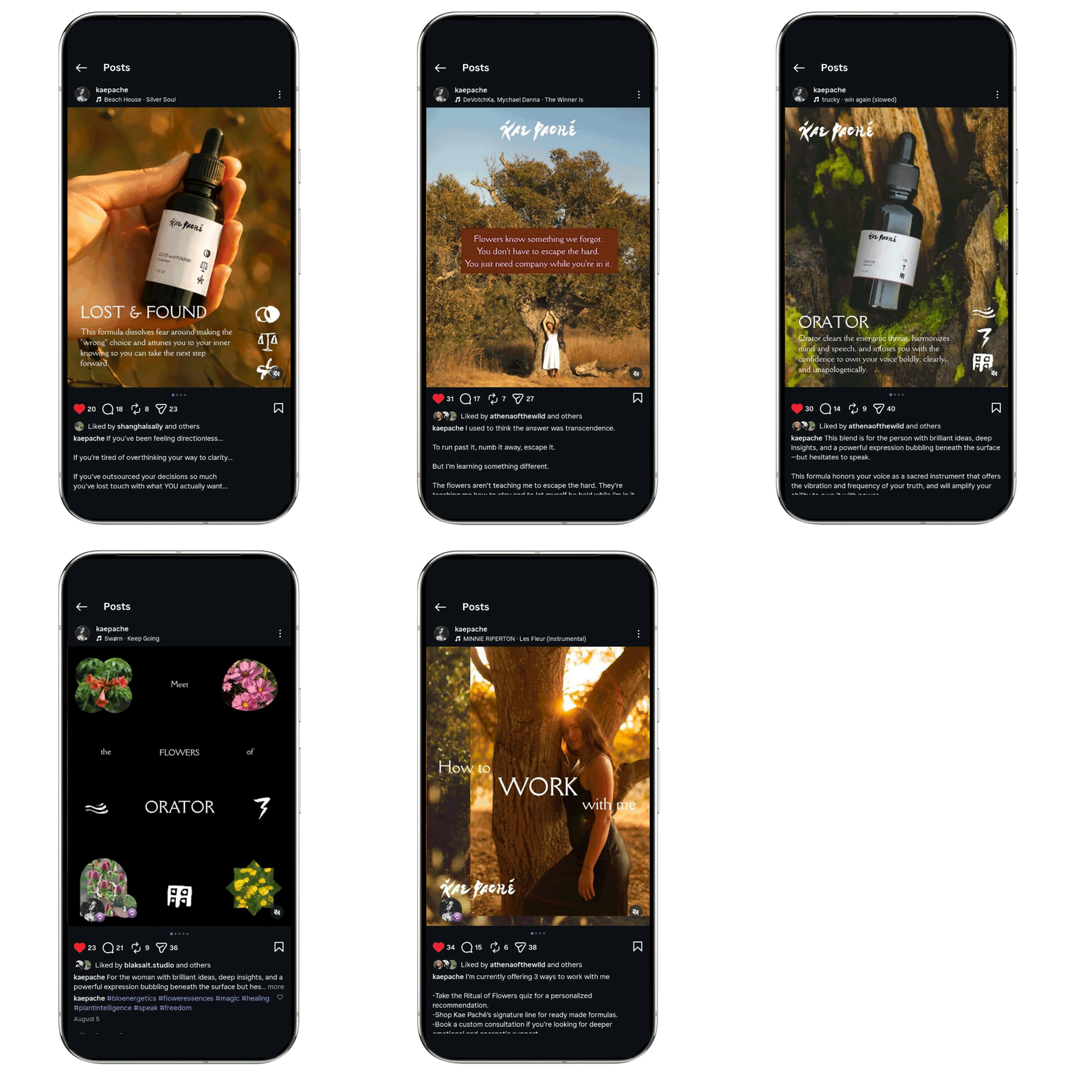
Follow Kae Paché on Instagram.
“I feel so taken care of. You set such a high standard for who I’m willing to work with.”
– Sydnie Kenoss, Kae Paché